
 Bestseller
Introducing · Brand & digital designer
Brands built to move.
Identity, packaging and websites, designed as one system and brought to life in motion.
Scroll to continue
About
Not just a designer.
I shape how brands look, feel and move. Fifteen years and more than thirty brands, from Sicilian nature reserves to Venetian saffron, from focaccia to real estate.
Exploded view
Eight disciplines. One system.
Every layer is a discipline. Stacked together they make one brand that looks the same on a jar, a shop window and a phone screen.
- L1Strategy & consulting
- L2Brand identity
- L3Packaging
- L4Websites
- L5Photo & video
- L6Social media
- L7Ads on Meta & Google
- L8Print & spaces
Detail
The details are the product.
15+Yrs of experience
30+Brands
8Disciplines
1System per brand
Applications
From the mark to the things people touch.
A logo is only the start. The same thinking runs on a gift box, a stand-up pouch, a phone and a live website. Real pieces from three projects, rebuilt in 3D.
Selected work
Three rooms to start.
Partnership
Partner of Leviathan.
I work in partnership with Leviathan, the Milan-based marketing agency that combines AI, automation, data, creativity and design. Powered by AI, guided by humans. For you it means one point of contact, and a full team behind it.
levthn.com ↗



01
One brief, a whole team
Brand and creative direction stay with me. When a project needs more hands, Leviathan adds strategists, developers, SEO, data and advertising specialists, under the same brief.
02
Platform partners
Through Leviathan, projects run on partner channels with Shopify, Google, Meta and TikTok: e-commerce and paid campaigns set up the way the platforms recommend.
03
AI and automation
Leviathan is a tech-powered agency: AI, automation and data. Reports, audiences and repetitive tasks are automated, so more time goes to ideas and results.
04
Scale when you need it
From a single logo to a dedicated team on subscription with LEVpod™: strategy, UX, design, development, SEO, data and advertising.
Partners and certifications through Leviathan
Packages
Pick your system.
| Included | IdentityStart here |
Identity ProResearch + things you can hold |
Full SystemFrom the study to the launch |
GrowthMonthly · social, ads, consulting |
|---|---|---|---|---|
| Strategy call & creative brief | ● | ● | ● | ● |
| Market & competitor analysis | — | ● | ● | ● |
| Logo & monogram | ● | ● | ● | — |
| Type & colour system | ● | ● | ● | — |
| Brand guidelines | — | ● | ● | — |
| Packaging or print | — | ● | ● | — |
| Marketing & launch plan | — | — | ● | ● |
| Website, design & build | — | — | ● | — |
| Photo & video | — | — | ● | ● |
| Motion & 3D | — | — | ● | — |
| Social media management | — | — | — | ● |
| Ads on Meta & Google | — | — | ● | ● |
| Monthly report & consulting | — | — | — | ● |
Packages are a starting point: every project is quoted on its own brief. Strategy and consulting are also available on their own, by the day or as a monthly retainer.
Academy
Ideas you can put to work.
Books on hospitality, golf and AI, practical guides and a membership with the systems I use to run brands and businesses.
Events
Where we can meet.
Talks, workshops and the events I attend. See what is coming up and book a meeting around them, in person or online.
Services
One designer, the whole system.
Eight disciplines that work together, from the market study to the last ad, so your strategy, your logo, your packaging and your campaigns speak the same language.
Scroll
Strategy
Strategy & consulting
Before anything is designed: who the brand is for, who it competes with and what it must achieve. Research, analysis and a plan you can act on.
- Market & competitor research
- Brand audit & positioning
- Marketing & launch plans
- Consulting by the day or monthly
Seen in Grana Padano × Ascovilo, Layers of Love, Eterna Rent
Identity
Brand identity
Logo, typography, colour and the rules that hold them together, so every touchpoint looks like the same brand.
- Logo & monogram
- Type & colour system
- Brand guidelines
- Stationery
Seen in Layers of Love, VisioneCasa, Eterna Rent, Haizum
Packaging
Packaging
Packs that stand out on the shelf and still feel special when they are opened at home.
- Product packaging
- Labels & stickers
- Bags & wrapping paper
- Gadgets
Seen in Zafferano Treviso, Canaparium, Layers of Love, Dal Bistecca
Web
Websites
Design and development of sites that load fast, read clearly and move with intent.
- UX & UI design
- Shopify, WordPress, custom
- E-commerce & landing pages
- Motion & 3D
Seen in Layers of Love, Eterna Rent, Zafferano Treviso, Barbera Café MENA
Production
Photo & video
Shoots for products, places and people, planned around how the brand will use every frame.
- Product photography
- Location shoots
- Event video
- Edits for social
Seen in Grana Padano × Ascovilo, Villa Rosa, Dal Bistecca
Social
Social media
A plan, a calendar and content made for each platform, so the brand keeps talking between one launch and the next.
- Editorial plan & calendar
- Posts, stories & reels
- Profile management
- Event coverage
Seen in Grana Padano × Ascovilo, Novea Skin Center, Neo Mediterraneo, Gadget Prime
Advertising
Ads on Meta & Google
Paid campaigns on Facebook, Instagram and Google, built on clear goals, measured every week and adjusted with the numbers.
- Meta Ads: Facebook & Instagram
- Google Ads: Search, Display, YouTube
- Tracking, pixels & analytics
- Creative tests & reporting
Seen in Ytheca by Fiorital, Flunch Italia, Porto Rotondo, Novea Skin Center
Spaces
Print & spaces
Brochures, menus, wall graphics and shop windows that carry the identity into the street.
- Brochures & menus
- Office wall graphics
- Window displays
- Event materials
Seen in VisioneCasa, Neo Mediterraneo, Eterna Rent
Partnership
Partner of Leviathan.
I work in partnership with Leviathan, the Milan-based marketing agency that combines AI, automation, data, creativity and design. Powered by AI, guided by humans. For you it means one point of contact, and a full team behind it.
levthn.com ↗
01
One brief, a whole team
Brand and creative direction stay with me. When a project needs more hands, Leviathan adds strategists, developers, SEO, data and advertising specialists, under the same brief.
02
Platform partners
Through Leviathan, projects run on partner channels with Shopify, Google, Meta and TikTok: e-commerce and paid campaigns set up the way the platforms recommend.
03
AI and automation
Leviathan is a tech-powered agency: AI, automation and data. Reports, audiences and repetitive tasks are automated, so more time goes to ideas and results.
04
Scale when you need it
From a single logo to a dedicated team on subscription with LEVpod™: strategy, UX, design, development, SEO, data and advertising.
Partners and certifications through Leviathan
Start here
Pick one service, or all eight.
Tell me about your brand →Work
Move into my work.
Twenty-two brands, from Sicilian nature reserves to a pasta bar in New York. Scroll to walk through the rooms: every project opens into its own case study, and the full list waits at the end.
Enter
01 / 06
Layers of Love
Identity · Website · Art direction
Italian comfort food in Miami, built as a culture magazine that happens to sell food: a redrawn vector mark, an ink-and-tape system and a custom Shopify theme.
02 / 06
VisioneCasa
Identity · Print · Spaces
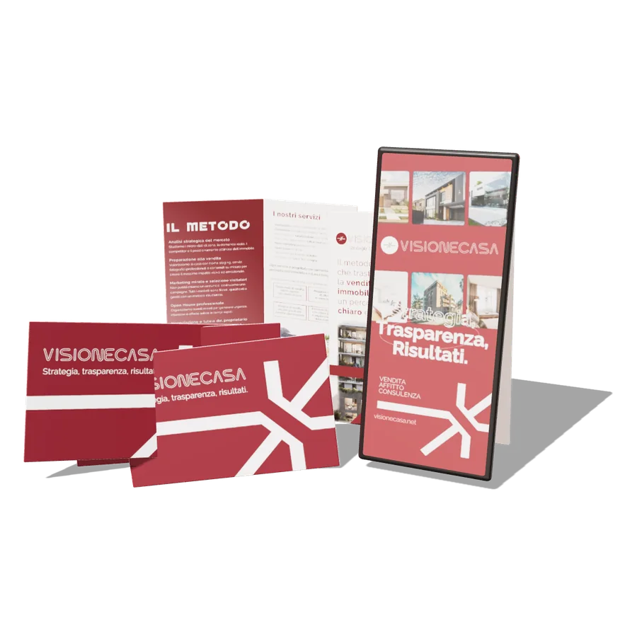
Brand identity, brochures and coordinated materials for a real-estate agency, plus graphics for the office wall and the street windows.
03 / 06
Zafferano Treviso & VillaRosa
Identity · Packaging · Websites
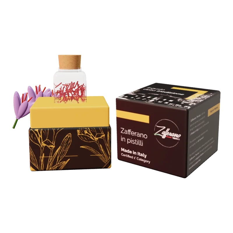
Identity, gift-box packaging and website for a Venetian saffron producer, together with VillaRosa’s logo, website and photo shoot.
04 / 06
Grana Padano × Ascovilo
Event content · Social storytelling
“Born to Be Together” at Milano Design & Art Week, 10–14 September 2021: launch strategy, content plan, brief for the photo and video team, post-production and social storytelling.
05 / 06
Eterna Rent & HouseRent
Identity · Websites
One compass, two doors: identity and websites for a short-term rental company, one brand for owners and one for guests.
06 / 06
Three Windows on Sicily
Logo design · Contest, 1st place
The winning entry for three nature reserves near Syracuse: Vendicari, Cavagrande del Cassibile and Pantalica. One frame, one hatched sky, three views.
Index
All projects
01Layers of LoveIdentity, Shopify website, art directionCase study →02HaizumBranding, web design, illustrationCase study →03Pasta EaterSocial media, content, campaignsCase study →04Zafferano Treviso & Villa RosaIdentity, packaging, websites, photo shootCase study →05RadaelliSocial media, content design, advertisingCase study →06VisioneCasaIdentity, print, signageCase study →07Three Windows on SicilyLogo design contest, 1st placeCase study →08Grana Padano × AscoviloStrategy, content and social storytellingCase study →09Ytheca by FioritalSocial media, art direction, advertisingCase study →10FGB ConsultingBranding, editorial, web designCase study →11Eterna Rent & House RentIdentity, brand book, websitesCase study →12CiriaconoBranding, print, web designCase study →13CerautoBranding, web design, graphic designCase study →14CanapariumBranding, packaging, illustrationCase study →15SinergaBranding, print, web designCase study →16Club Porto Rotondo & The BaySocial media, advertisingCase study →17Flunch ItaliaSocial media, advertising, web designCase study →18NOVEA Skin CenterBranding, web design, social mediaCase study →19Dal BisteccaBranding, logo design, illustrationCase study →20NEO Mediterraneo VibesSocial media, advertising, menu designCase study →21Café Barbera MENAWeb design, UI/UXCase study →22Gadget PrimeBranding, social media, web designCase study →
Layers of Love
Italian comfort food, redesigned for America
Case study · 01Miami · 2026Scroll
Case study · Brand identity, website, art direction
Pasta, but make it culture.
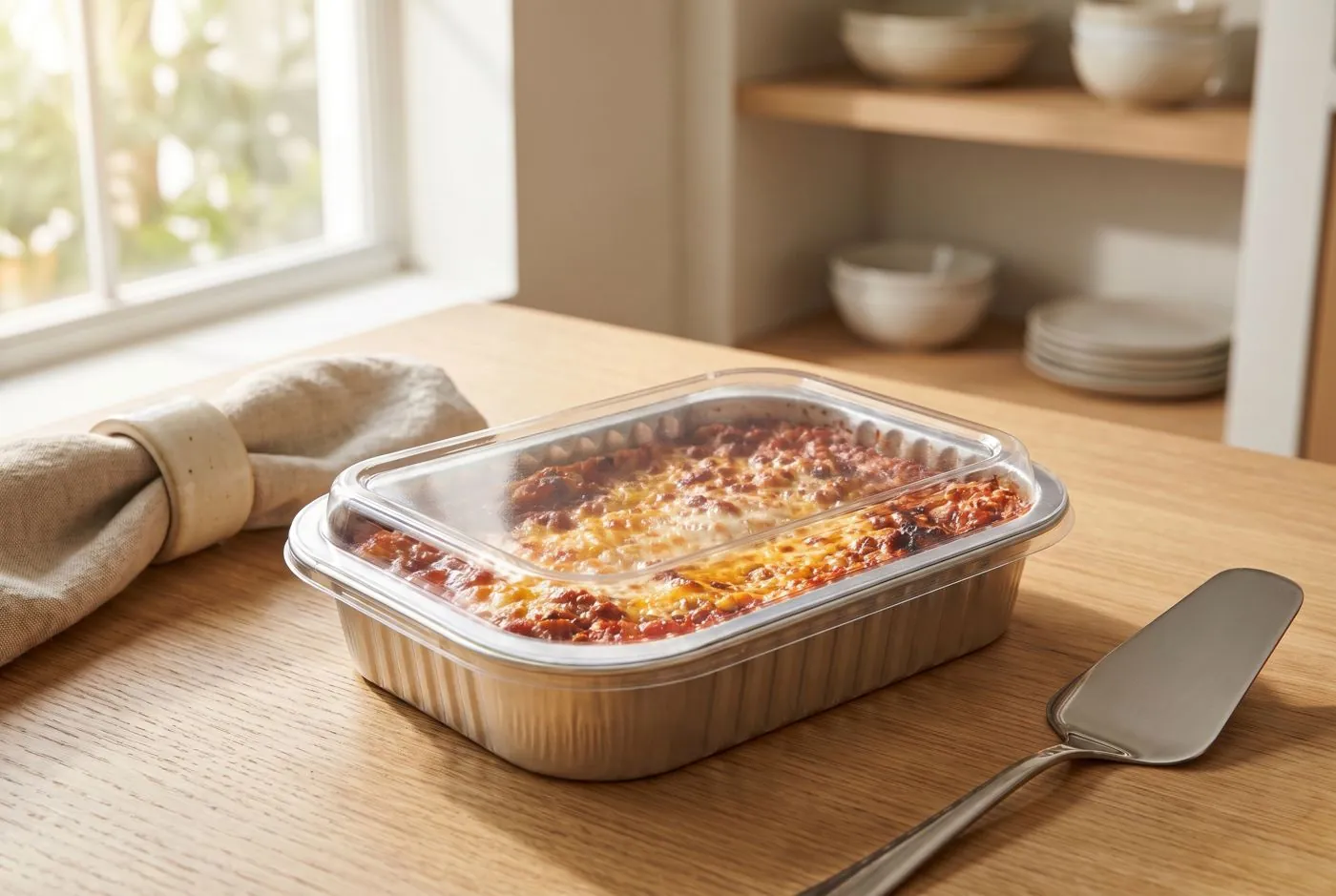
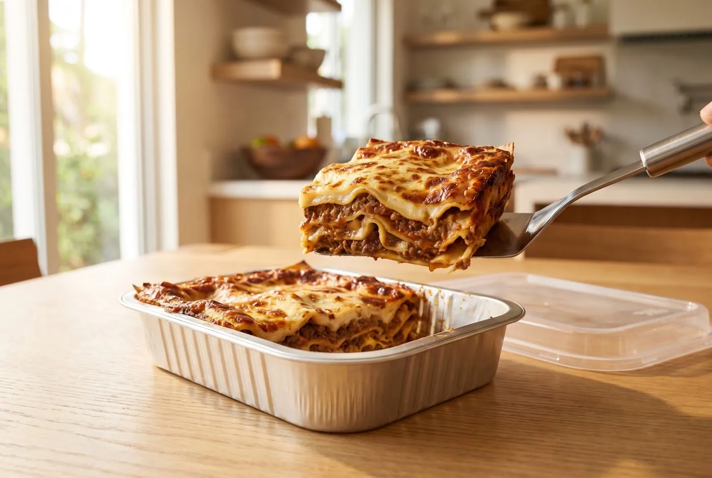
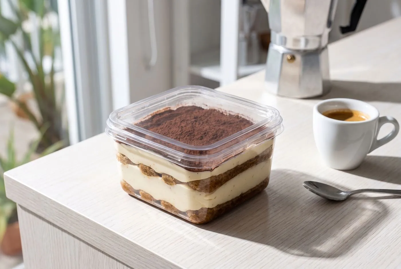
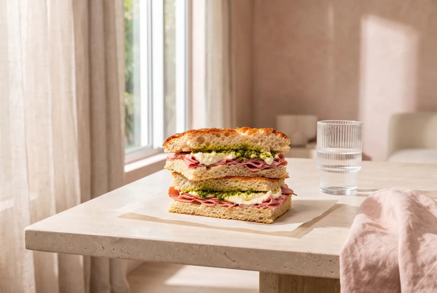
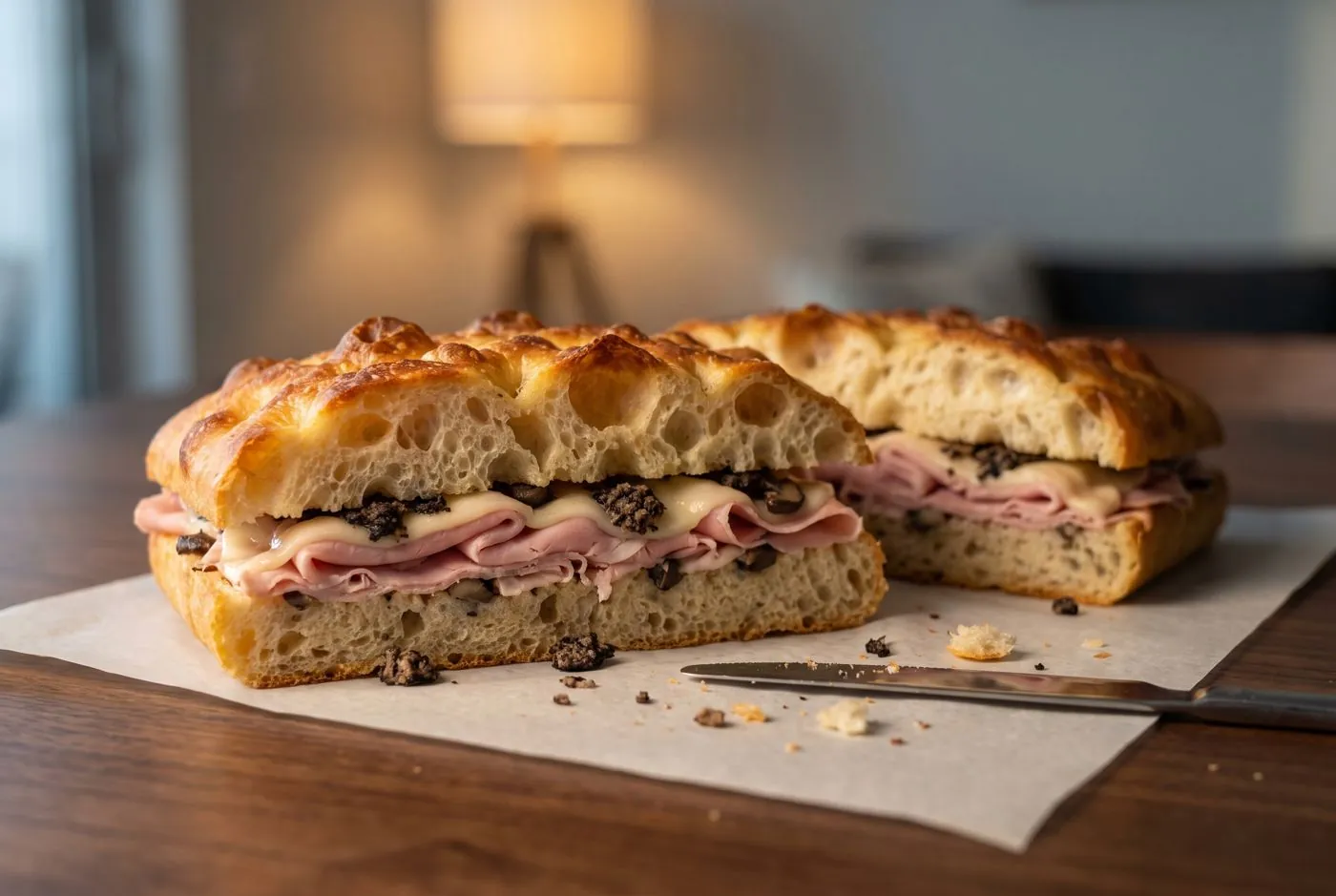
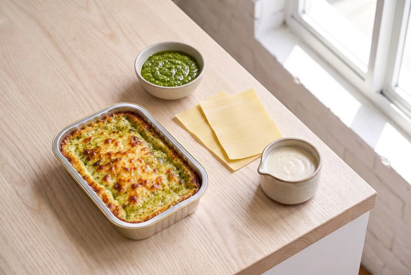
Layers of Love makes small-batch Italian comfort food in Miami: fresh-pasta lasagna, tiramisù, stuffed focaccia and catering. We built the brand as a culture magazine that happens to sell food.
The brief
A food brand ready to sell online.
- 01Redraw the logo as a clean vector, with a palette and brand fonts
- 02Logotype and wordmark for packs, labels and the web
- 03A website on Shopify with separate B2C and B2B price lists
- 04Explain ready-to-heat and frozen products, and why blast chilling matters
- 05Orders and delivery across Miami-Dade, linked to the delivery platforms
The idea
“The Layers Issue.” Every product is a numbered issue, green is the ink, red is the food, yellow tape interrupts.
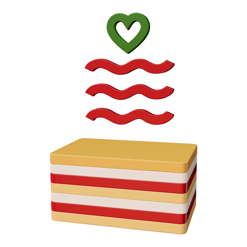
No luxury, no white-tablecloth cues: the tone is warm, ironic and editorial pop, at accessible prices. The logo already holds the idea of layers: a heart over three waves, like sheets of pasta. The website is built the same way, in stacked sections.
The heart · on top
Top layer
Middle layer
Base
01 · The mark
One heart.
Three layers.
The original logo was redrawn as clean vectors. The heart sits on top, three waves stack underneath like sheets of pasta: top, middle and base. It works in full colour, in one colour and in white, from a favicon to a delivery bag.
02 · Ink
Printed
in green.
Every page follows the same proportions: white paper about half, green ink a quarter, red around fifteen percent, a touch of yellow tape and almost no blue. Hover or tap a colour to see where it goes.
03 · Type
LASAGNALASAGNALASAGNA
ABCDEFGHIJKLM
NOPQRSTUVWXYZ
0123456789 & $!?
Fresh pasta, slow-cooked ragù, creamy béchamel. Made with love in Miami.
LOL, the brand's own display face, uppercase at 0.84 line height, with an outline echo. Bricolage Grotesque for everything you read.
04 · The system
Tape, cells,
numbers.
Bestseller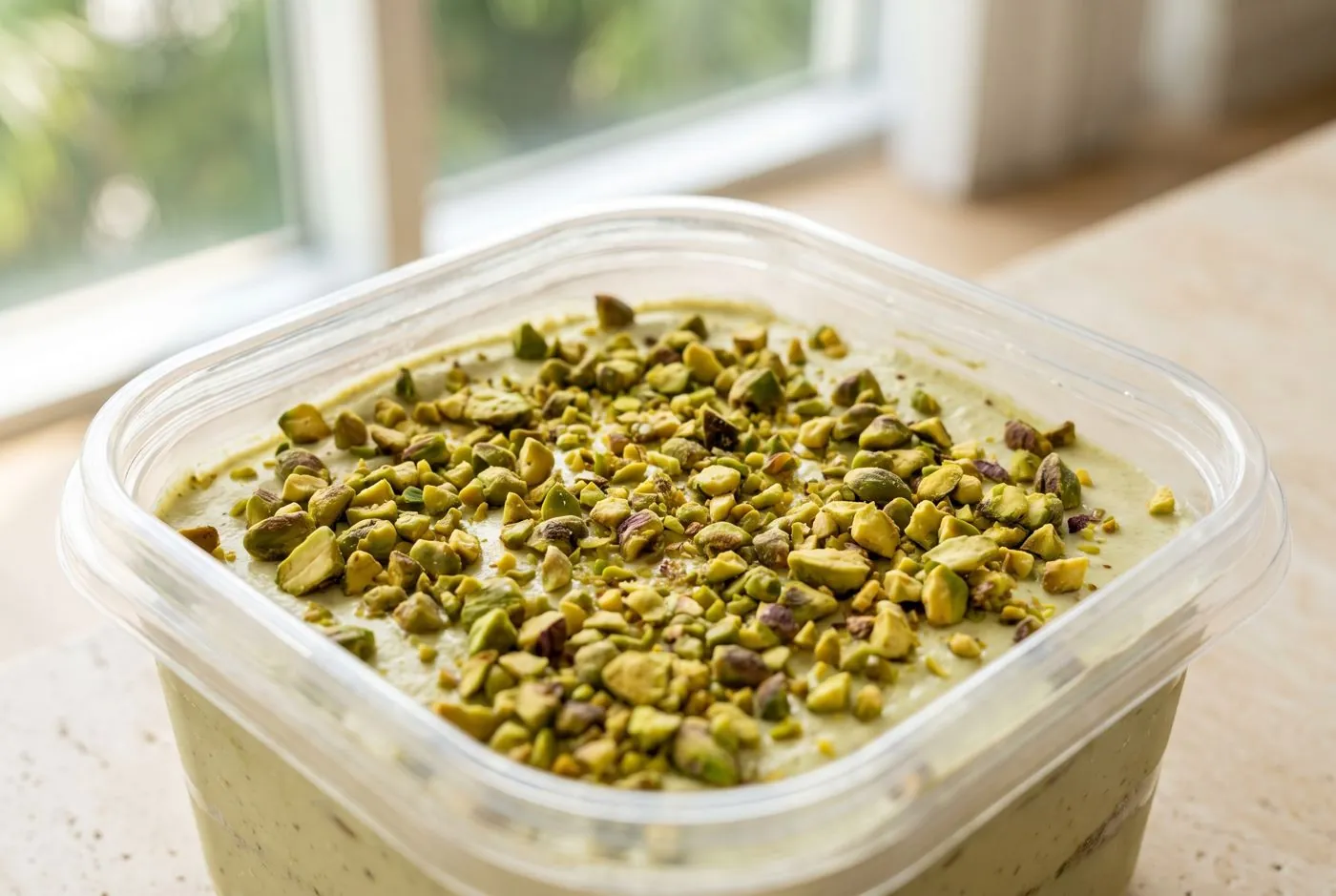 New flavour
 Hot right now
 For 10+
05 · A site in layers
Built like a lasagna.
The Shopify theme is a stack of sections. Scroll to pull the layers apart.
- Header
- Cover story
- In this issue
- The product
- Footer
06 · In real life
Ooh. Ahh.
Mmm.
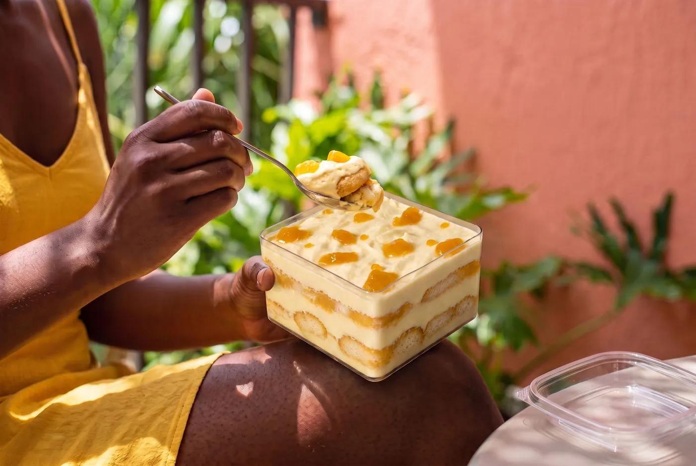
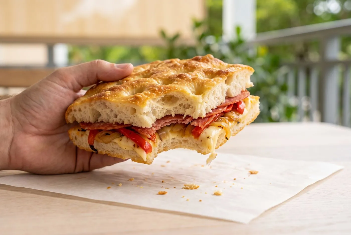
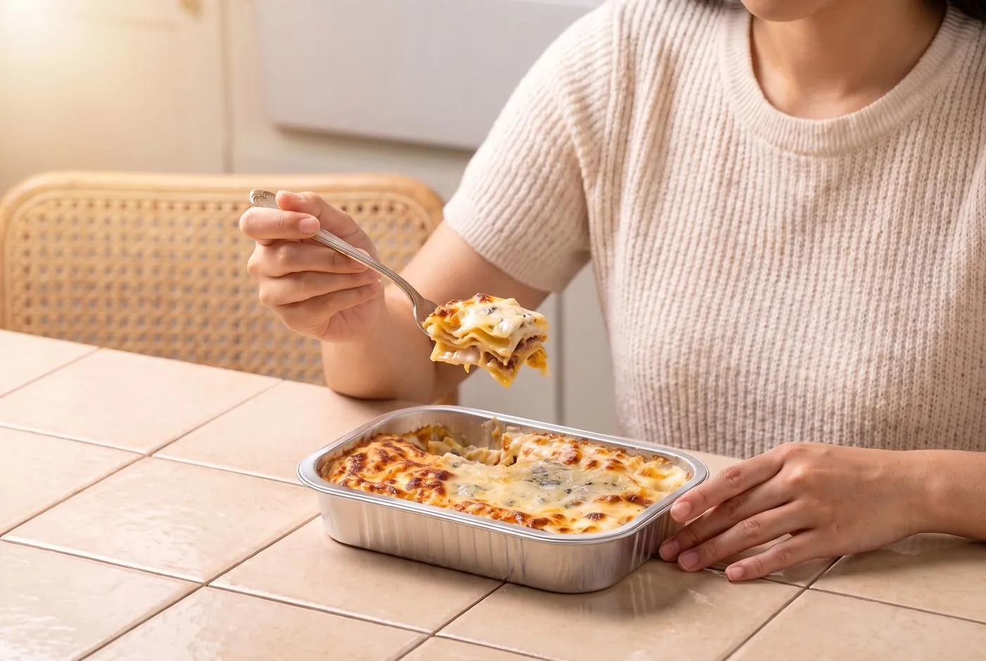
Product imagery: AI-generated sets, art-directed from approved product facts.
MORE LAYERS.MORE LOVE.MORE LAYERS.MORE LOVE.MORE LAYERS.MORE LOVE.
01 LASAGNA02 TIRAMISÙ03 FOCACCIA04 CATERING01 LASAGNA02 TIRAMISÙ03 FOCACCIA04 CATERING
Services
- 01Brand identity and vector logo
- 02Colour, type and component system
- 03Shopify website, design and build
- 04Art direction of product imagery
- 05Motion: logo reveal, 3D, kinetic type
Credits
Design, art direction and web: Luca Colucci.
Client: Layers of Love, Miami.
Product imagery: AI-generated, art-directed from approved product facts.

Powering Precision Needs
Brand identity, print and website for a custom-transformer maker
Case study · 12Busto Arsizio · ItalyScroll
Case study · branding, print, web design
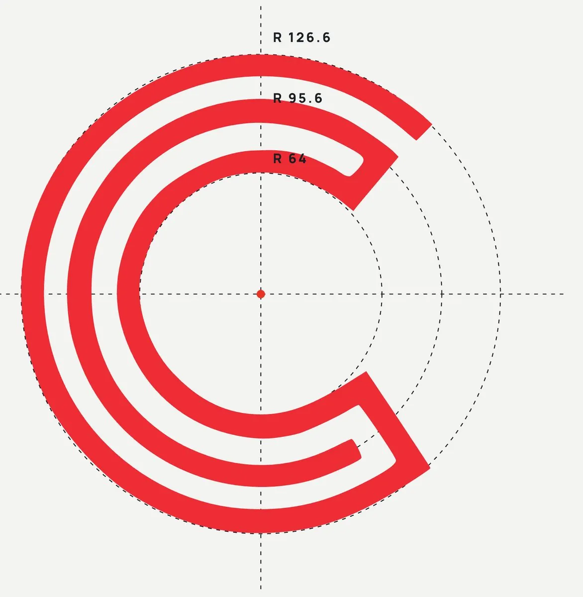
A letter wound like a coil.
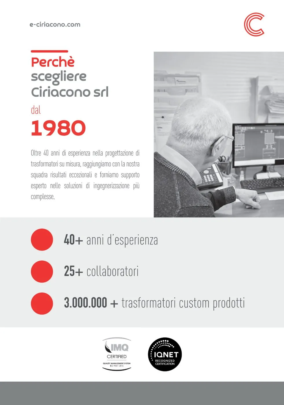
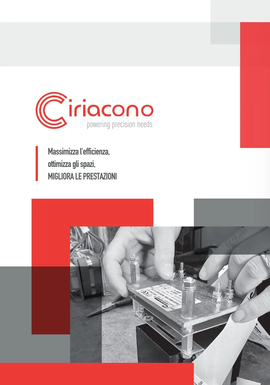
Ciriacono has designed and built custom electrical transformers in Busto Arsizio, Italy, since 1980. The new identity starts from the product itself: the C is drawn with three parallel lines that wrap around a common centre like the windings of a coil. A bold red, a technical grey and plenty of white space carry the system from business cards and letterhead to an 8-page brochure and the company website.
The brief
What was needed
Founded by Giacomo Ciriacono and still run by the family, the company needed an identity as precise as its products. It had to move from a nameplate to a brochure, a business card and a website without losing its edge.
The idea
How it was solved
The C is drawn with three parallel lines that turn around one centre and fold back at the ends, the way copper wire is wound around the core of a transformer. Red blocks, grey bands and black-and-white workshop photos carry that technical precision through print and web.
Three windings, one letter.
01 · The mark
Wound like a coil.
The C is drawn with three parallel lines that turn around a common centre and fold back on themselves at the ends, the way copper wire is wound around the core of a transformer. The letter stays open on the right and leads the eye into "iriacono".
- Three windingsThree lines of equal weight, evenly spaced like the turns of a coil.
- One centreAll curves share the same centre, so the letter keeps a calm, engineered rhythm.
- Folded endsEach line turns back at the tips like a wire terminal and closes the letter without cutting it.
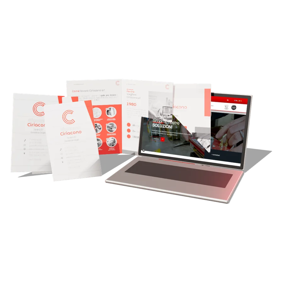 LogoBrand kitStationeryBrochureWebsite
02 · Colour
The palette
Ciriacono red
#EA3324 · RGB 234·51·36 · CMYK 0·95·91·0primaryGrey
#8B8B8B · RGB 139·139·139 · CMYK 46·36·36·16secondaryWhite
#FFFFFF · RGB 255·255·255 · CMYK 0·0·0·0groundHex, RGB and CMYK values from the Ciriacono brand kit (27 Dec 2023). Titles in Croogla 4F, text in Manrope, claim in DIN Condensed.
03 · Applications
Where it lives.
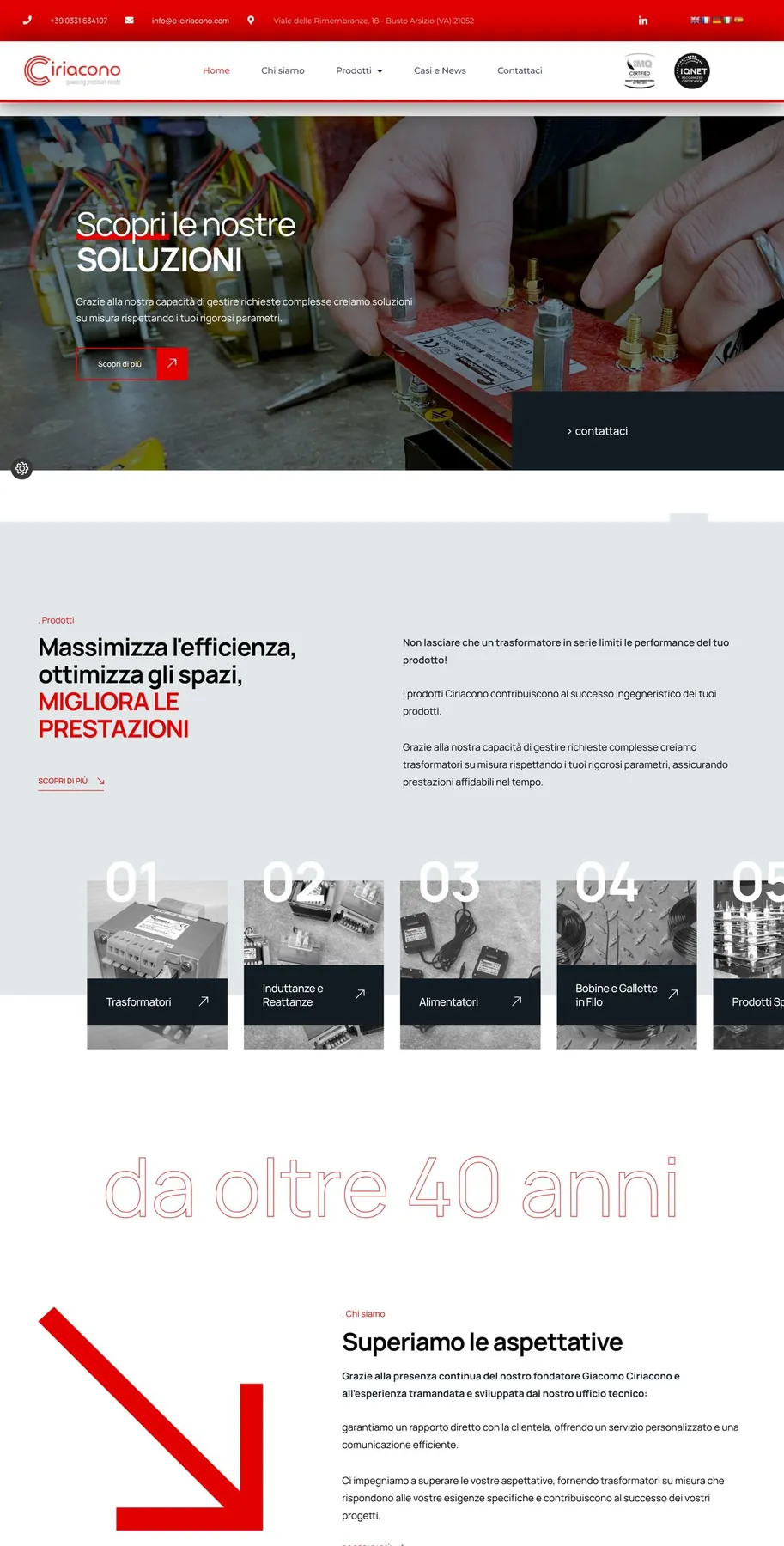
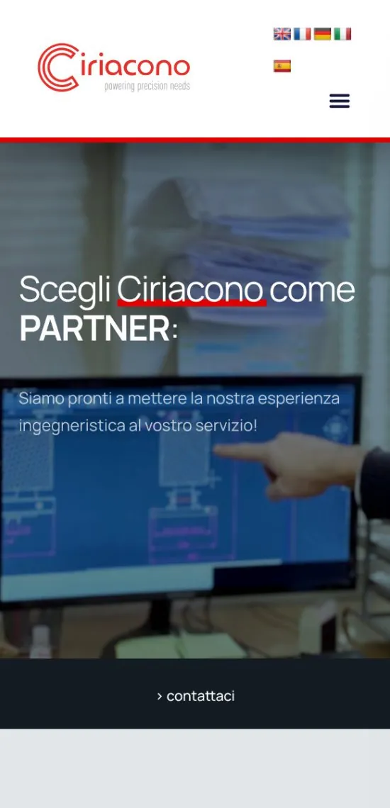
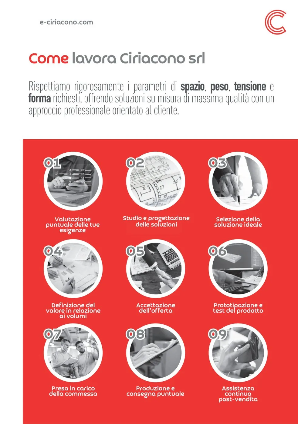
What I did
- 01Logo system: wordmark, C symbol and claim
- 02Brand kit: palette, colour combos and typography
- 03Business cards, digital business card and letterhead
- 048-page brochure (2024)
- 05Website e-ciriacono.com, desktop and mobile
- 06Art direction of the photography from the company shoot
Credits
Client: Ciriacono srl, Busto Arsizio (VA), Italy
Brand identity, print & web: Luca Colucci
Type: Croogla 4F · Manrope · DIN Condensed
Photography: company photo shoot. Business-card views are flat mock-ups made from the original print files (the page-curl shading is part of the mock-up).
Audit · Preview
Digital Audit.
A free check-up of your brand online: website, SEO, tracking, social media, ads and marketplaces. Answer a few questions, and while the analysis runs you get a report with what to fix, a plan of work and a starting price.
Demo with sample results · the live audit is coming soon
How it works
Four minutes, one report.
- 01
Tell me about the business
Company, website, social channels, marketplaces, goals and budget. The more you share, the sharper the audit.
- 02
The analysis starts
Your site and channels are read automatically: structure, SEO, speed, tracking pixels, social profiles and competitors.
- 03
Leave your details
While the analysis runs, tell me where to send it. Name, company, email and phone, with your consent.
- 04
The report arrives
The audit, a plan of activities with me or with the Leviathan team, and a starting price. I review every report before we talk.
What is checked
Everything a customer sees first.
Website & architecturePages, menus, structure, content and how clearly the site leads to a sale or a contact.
SEO & visibilityTitles, descriptions, headings, indexing, keywords and how you rank against competitors.
Speed & mobileCore Web Vitals, image weight and how the site works on a phone.
TrackingMeta Pixel and Conversions API, Google Analytics 4, Tag Manager, conversion events.
Social mediaInstagram, Facebook, TikTok, LinkedIn: profiles, posting rhythm, formats, consistency.
AdvertisingMeta and Google Ads: what is active, how it is measured, where budget is lost.
MarketplacesAmazon and other marketplaces: listings, images, reviews and the brand store.
Brand & competitorsPositioning, tone and identity compared with the brands you compete with.
What you receive
An audit, a plan, a price.
The auditA score for each area, what works and what to fix first, in plain language.
The planThe activities that would make the difference, done by me or with the support of Leviathan when a whole team is needed.
A starting priceAn estimate based on your brief. It is a starting point: after a call the final quote can move by 30–40%.
About
From the kitchen to the brand.
I'm Luca Colucci, a brand, marketing and digital consultant based in New York. Before strategy and design I worked in kitchens and dining rooms, so I build brands the way a good service runs: planned, precise and made for people.
Scroll to turn me around
Skills
Learned on the job, used on yours.
Kitchens, dining rooms, agencies and my own practice. Each skill around me comes from one of them: tap it to see where I learned it and the projects it shaped.
Today
Everything I learned, for your brand.
Contact
Let's make it move.
Tell me about your brand, your launch, or the website that needs a rethink. I read every message.
- 01Send the form: it takes a minute.
- 02I reply within two working days.
- 03A first call to understand the brand, free of charge.